Elda’s Construction, Realty & Home
Whether clients are building something new, renovating a space, or searching for their dream home, Elda’s is designed to be a solution-based, one-stop shop.
Elda’s was a unique challenge for me because I wanted to ensure the brand conveyed the ambition and heart of its founder. Named after the founder’s mother—with colors inspired by her favorite holiday, Christmas—I knew the identity needed to capture that personal connection. Elda’s had to feel warm, friendly, and approachable, just like Elda herself, while also fitting into the realty and construction world and standing out at the same time.
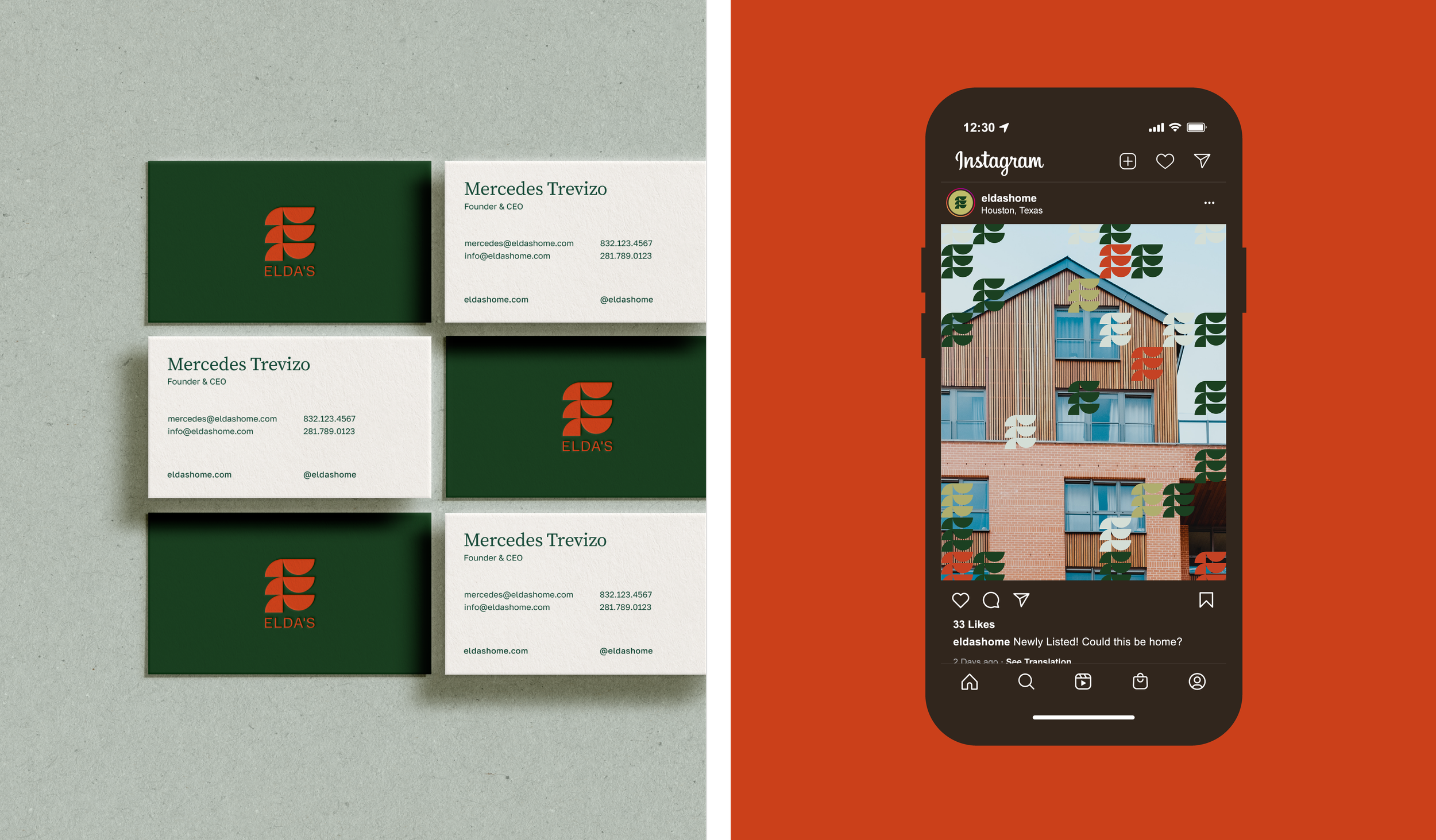
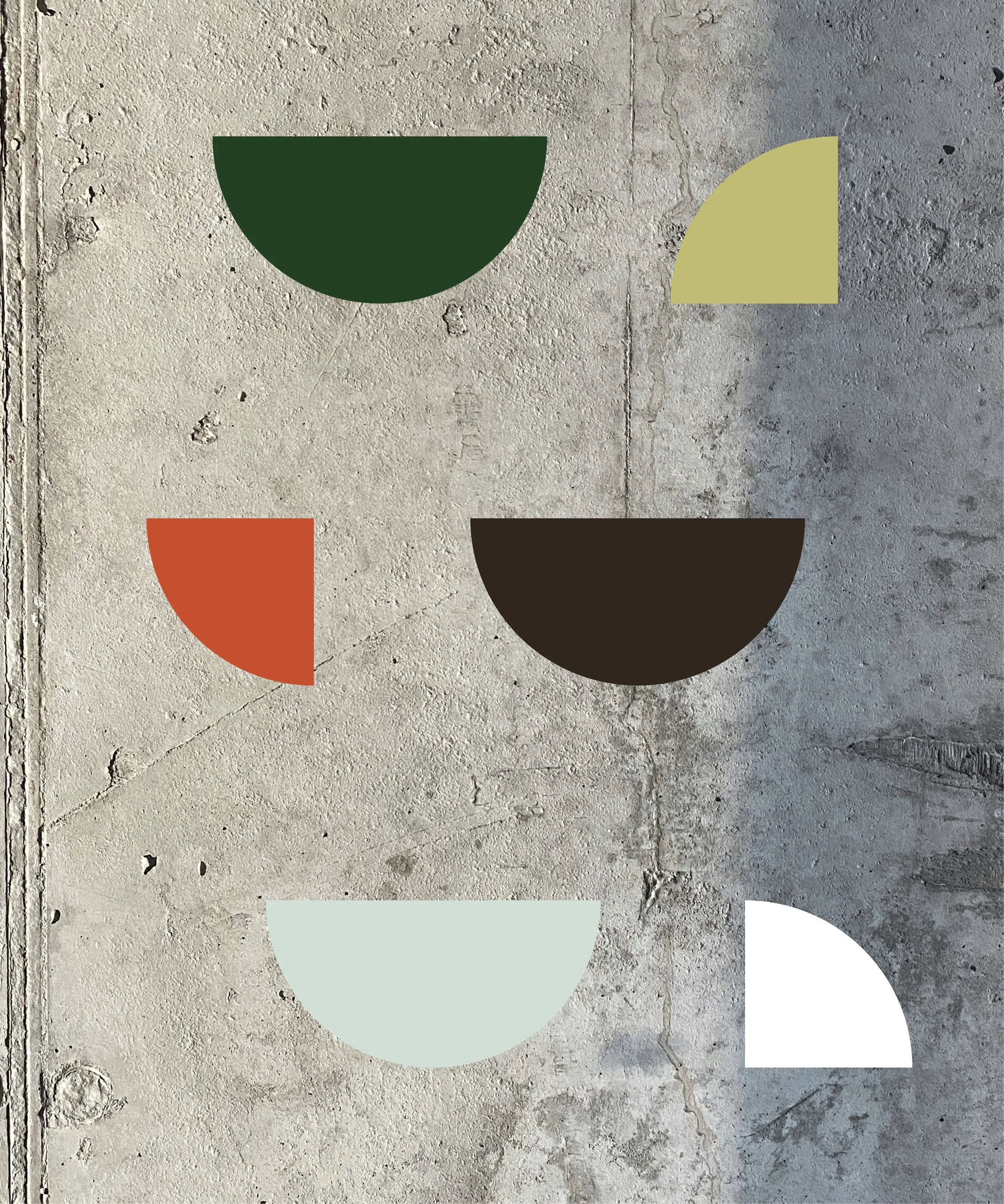
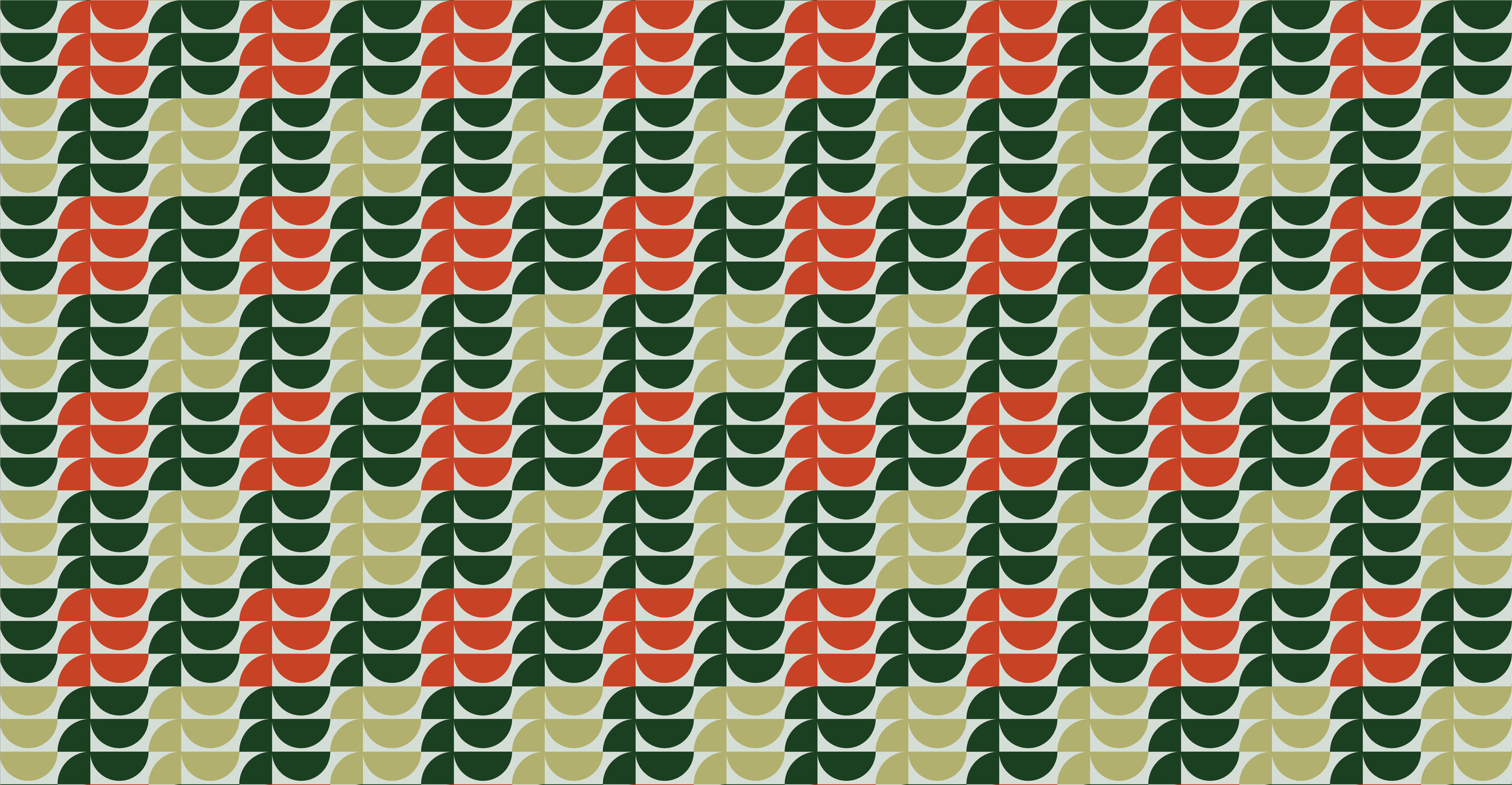
The E icon was designed using shapes that represent the building blocks of a home. The three arms of the E symbolize the core values that drive the founder’s daily work: Enthusiasm, flawless Execution, and dedicated Effort to help clients.
The brand’s primary colors—green and an orangey-red—are balanced with lighter green and pale blue to add a subtle vintage feel. Layering the brand’s patterns over home photography creates a sense of reveal, as if Elda’s is uncovering the perfect home for its clients.
Branding
Strategy
Social Content
Signage
Website